A Visual Story Begins From Data
Spreadsheets are typically used for lists, data, and charts. But when used as the foundation of an interactive story timeline, they come alive. Turning spreadsheets into interactive story timelines allows content creators and storytellers to transform raw information into a compelling visual journey. For those seeking a clear and dynamic narrative flow, this method brings data to life in ways that engage and inform.
Rather than relying on plain text or static images, an interactive timeline provides much-needed context. It acts as a guide through a personal story, historical narrative, or even a corporate report. By combining a simple column of dates and events with data-driven storytelling, you can craft a visual journey that’s easy to follow.
Using a spreadsheet as a source is not only practical—it’s also flexible. It can be updated, filtered, and embedded on various platforms. So if you want your story to last and evolve, this is a great place to start.
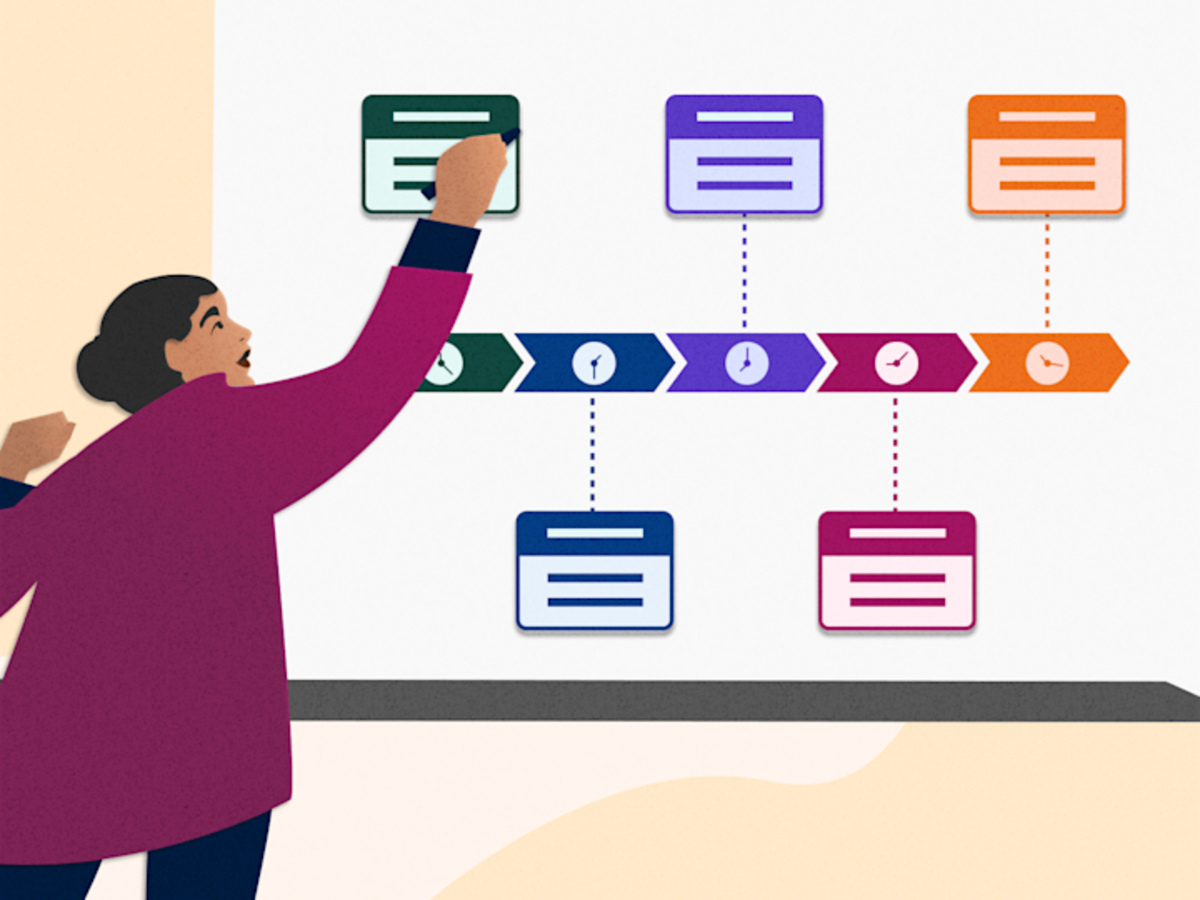
Defining the Purpose Before Conversion
Before building your timeline layout, you must clearly define your purpose. The structure differs depending on whether it’s a personal memory, a series of research milestones, or a product summary. Turning spreadsheets into interactive story timelines works best when the shape of your data matches the flow of your narrative.
For example, if you’re outlining steps in a community project, a linear sequence of dates and actions works best. But if your story focuses on character relationships, context is more important than exact timestamps. Your presentation style changes depending on your intent.
Purpose guides both your content and your design. If your timeline targets an audience unfamiliar with data visuals, use a simpler approach. For educational audiences, you may want to include sources or documentation alongside the story.
Organizing Spreadsheet Data for Narrative Use
A clean spreadsheet starts with clear columns: date, event name, description, and media (like images or links). Each row is a story element. The more consistent your format, the easier it is to convert the sheet into an interactive tool.
Completeness matters too. Even if you’re starting with rough notes, make sure key details aren’t missing. For example, in a family history timeline, include birth years, locations, and short anecdotes.
If you plan to use tools like TimelineJS or Flourish, follow their formatting templates from the start. Aligning your data structure early speeds up the conversion process and avoids backtracking later.
Using Online Tools Like TimelineJS
Once your spreadsheet is ready, the next step is to convert it using free online platforms. One of the most popular is TimelineJS. The process is simple: use Google Sheets, follow the template, publish it to the web, and paste the link into the TimelineJS embed field.
TimelineJS supports images, videos, links—even audio clips. It’s ideal for historical projects, character arcs, or personal milestones. And you don’t need coding skills to create a professional-looking timeline.
If you prefer more graphic-based interfaces, tools like Tiki-Toki or Knight Lab offer alternative experiences. What matters is choosing the platform that best fits your style and audience. There’s no one-size-fits-all here—your purpose determines the tool.
Adding Media for Visual Impact
One of the strengths of an interactive timeline is its ability to incorporate media. You can embed old photos, scanned documents, video clips, or even sound bites. The story becomes more vibrant and meaningful with visual support.
For a travel timeline, you can include images of each location mentioned. For personal histories, old photographs provide emotional connection—especially for readers unfamiliar with the context.
Media isn’t just decorative—it’s part of the story. Make sure it’s placed meaningfully, not just for aesthetics but to deepen the audience’s understanding of each moment.
Considering the User Experience
Even with great data and media, your timeline won’t work if it’s hard to navigate. So testing before sharing is essential. Click through every event, read the content, and adjust anything that doesn’t feel intuitive.
Ask friends or colleagues to review it. Have them test readability, load times, and any confusing transitions. Your goal is not just accuracy, but smooth storytelling.
If your audience includes mobile users, responsiveness is key. Many people view timelines on phones—so make sure your design adapts well to smaller screens.
Matching Visual Style to the Narrative
The color scheme, fonts, and layout of your timeline affect its tone. For personal stories, soft tones and minimal designs work well. For corporate or educational timelines, a more structured, formal layout is appropriate.
Aesthetic choices are not just about beauty—they shape emotion. So even if you’re using a default template, adjust it to match the theme. For example, a climate event timeline might use cool blues and greens to reflect the topic.
You don’t need to be a graphic designer. Just choose visual elements that enhance rather than overshadow your story. Always remember: visuals should support, not overpower.
Planning for Updates and Audience Feedback
If your timeline is part of an ongoing story—like a project’s development or a documentary—it’s important to set up a structure for updates. Choose tools that allow easy data editing over time.
Google Sheets is ideal for this. When linked to a timeline tool, any new row added to your sheet will appear on the timeline after a refresh. This is especially useful for journal-based stories or logs.
Encourage feedback, too. Add a comment form or email link at the end of your timeline. This makes your storytelling more open and participatory—inviting your audience to contribute and connect.
Expanding the Story Across Platforms
Once your timeline is complete, don’t limit it to just one site. You can embed it in a blog, share it on social media, or use it in classrooms. The more users interact with it, the further your story reaches.
For educators, it’s great as a teaching aid. Pair it with quizzes or discussions. For content creators, it can serve as a teaser or visual summary of a longer article or video.
Don’t be afraid to repurpose it. A good timeline can become the blueprint for a documentary, podcast, or photo series. It’s just one step in a broader storytelling ecosystem.
Finding Stories Within Data
Ultimately, the most powerful interactive timelines begin with a simple spreadsheet and a clear story. Turning spreadsheets into interactive story timelines helps transform rows and columns into something far more engaging and emotional. You don’t need tons of media or color. As long as it’s honest, organized, and purposeful—it will resonate.
Each row of a spreadsheet is a piece of the narrative. Each column adds context. When brought together in a visual interface, they come alive—a story that’s not just read, but experienced.
You don’t need the perfect moment or perfect tool to begin. Start with what you have—a spreadsheet, an idea, and a goal. In building your timeline, you might even discover your story more deeply than before.